Does your logo need a new vibe? Are you stuck in the 90’s?
Your logo is the face of your business. This icon is splashed on your social media, storefront signage, marketing material, embroidered on your shirt, etc. … in other words it’s the visual representation of everything for which your company stands. No pressure guys but its kind of a big deal. What is your logo saying about your business? Here are a couple of things to consider:
1. “Less is more” – Mies Van Der Rohe
Really look at the Target, Apple and Walmart logos- a common denominator is that they’re simple which can also lead to a classic, long-lived logo. When we over-design our logo it can make it difficult for clients to understand your brand. It also tends to feel more outdated faster. We wanted a simple, classic logo for Griffin Real Estate Group. Being in the real estate industry they needed a clean logo and font that can be easy to read on the real estate signs. 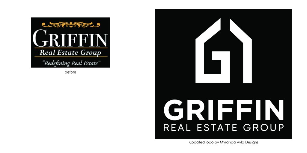 2. A logo refresh
Think of this as a new haircut or new outfit for your logo. Small tweaks can give your logo a fresh, new look. This can even be a slight change in font or color. Like the Apple logo above, updates don’t mean that your logo won’t stand the test of time, it just means you are keeping up with the times. Allie Martin Weddings wanted a new look for their 10th year in business!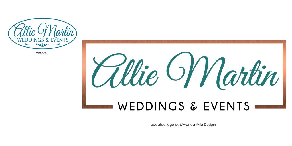
3. Versatility is your friend
One of the first questions I ask is “How will you be using this logo? ”
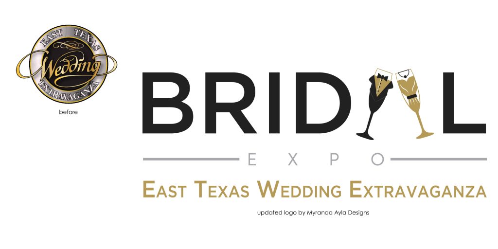
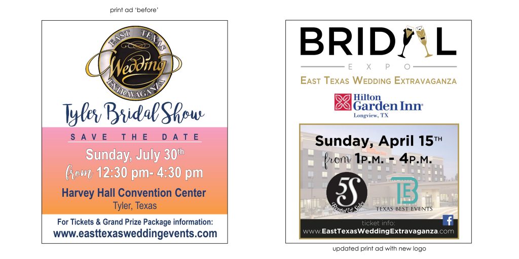
Besides updating this logo with the times we needed a logo that would be “print friendly”. 90% of East Texas Wedding Extravaganza‘s marketing is through flyers, posters, signage, social media and ad print. We needed a logo shape that would layout efficiently with printed marketing material. Take a look at the two ad comparisons. We were able to gain more readability with the new logo and save space to add more information and visual interest to the ad.
4. Logo Language
The logo should clearly communicate your business and the services you provide. The logo (icon and business name) should be able to be used independently of one another and represent the business industry. We created an icon below using a tooth in conjunction with an S to create a unique logo for Tim Smith Dental. The tag line ‘Family and Cosmetic Dentistry’ clearly defines his services. 
Now it’s reflection time. Does your logo reflect the intent of your business? Does your logo give a good representation of your company?
If you have answered NO to any of these questions feel free to shoot me an email with your logo. I will be happy to consult with you!
Creatively yours,
Myranda

